")


Soft Autumn Color Palette: Colors, Makeup & Style
Want to know what the soft autumn color palette is and how it can transform your entire look? I used to grab whatever colors caught my eye without understanding why some made me glow while others didn’t.
This issue is resolved by the gentle fall colour scheme, which provides you with a clear path of aesthetically pleasing hues. Knowing your colour season eliminates all uncertainty when it comes to purchasing clothing, cosmetics, and even hair colour.
You won’t waste money on items that don’t fit you at all and go unworn. Knowing your colours helps you dress more quickly and with less anxiety every morning. Let’s review all of the information you require regarding this colour scheme.
What Is the Soft Autumn Color Palette?
Okay, let me explain this in a way I wish someone had explained it to me years ago.
Soft autumn is one of twelve sub-seasons within the seasonal color analysis system. It sits at the intersection of summer and autumn borrowing warmth from autumn and softness from summer and the result is a palette that is gentle, earthy, and deeply harmonious. I think of it as the color equivalent of a warm Sunday afternoon in October: golden, calm, and absolutely beautiful.
Think dusty roses, muted olive greens, warm taupes, and subdued terracottas colors that feel grounded and natural rather than loud or dramatic. What makes soft autumn distinct from true autumn is its muted quality. Where true autumn leans into rich, saturated tones, soft autumn keeps everything slightly toned down, creating a look that is warm but never overwhelming.
When I first saw the full soft autumn palette laid out together, I remember thinking, “These are my colors.” There’s something almost instinctive about recognizing your season and I want that moment for you too.
Key Characteristics of the Soft Autumn Palette
I spent a long time researching this before writing it up, and I’m really proud of how clearly this section breaks it down. Here’s what defines this palette at its core:
Undertone: Soft autumn has a warm undertone, leaning golden rather than pink or cool. This warmth is subtle and quiet think honey and amber rather than bright copper or fire. It’s the kind of warmth that feels like it belongs, never forced.
Contrast level: Low to medium contrast characterizes soft autumn. The palette blends smoothly, without stark light-dark clashes. If your natural coloring skin, hair, and eyes transitions gradually rather than dramatically, soft autumn may well be your season.
Overall effect: The goal is a natural, blended appearance. Colors that create harmony rather than contrast tend to look most flattering on soft autumn types. When you get it right, people won’t necessarily say “I love your outfit” they’ll say “You look amazing today.” That’s the magic of wearing your colors.
Your Best Neutrals
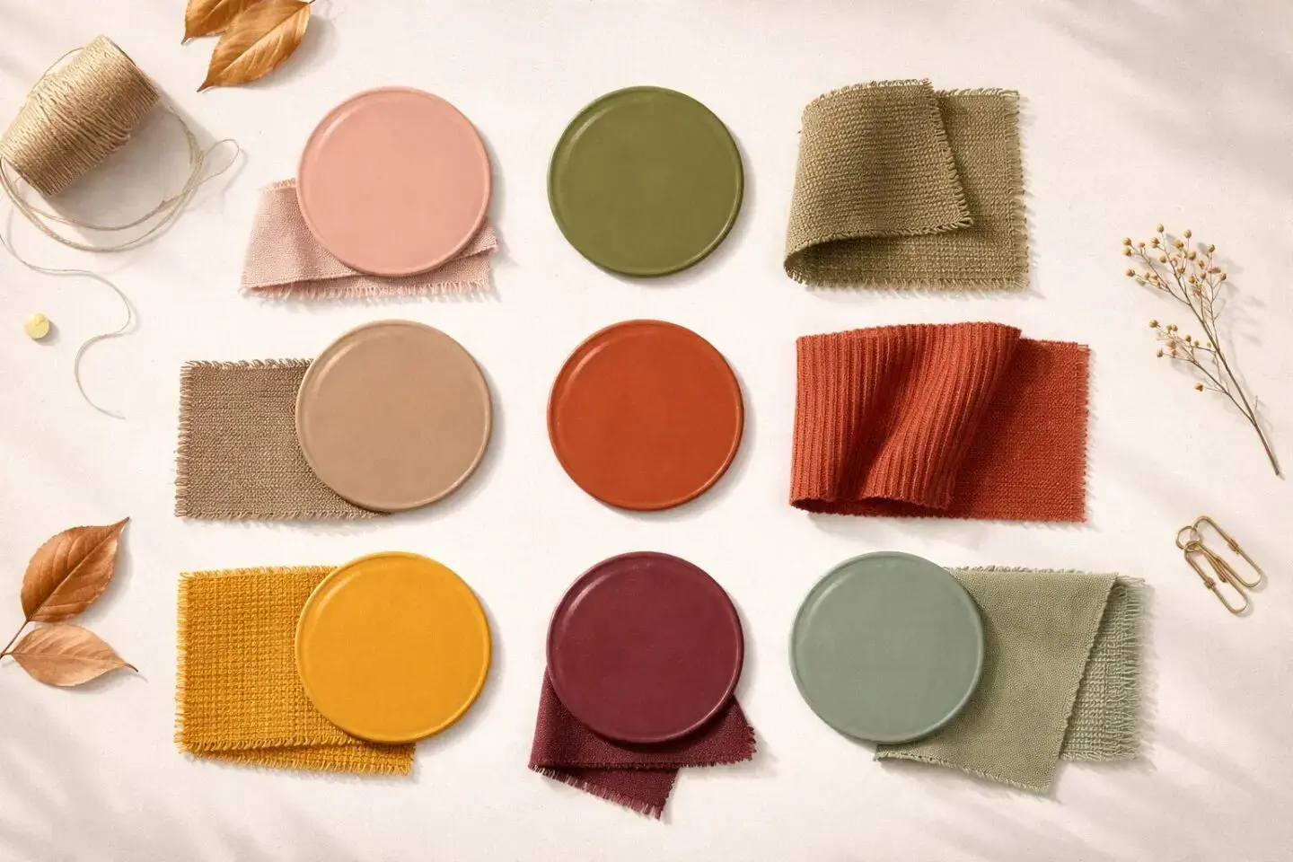
This is the section I wish I’d had years ago, because building your wardrobe on the right neutrals is genuinely a game-changer. I’ve helped a few friends rework their closets using this framework, and the difference is always remarkable. For soft autumn, it means stepping away from stark black and pure white in favor of these foundational shades:
Warm beige and camel replace harsh white with a soft, creamy warmth that sits beautifully against soft autumn skin. Olive and khaki function as versatile earthy neutrals that pair effortlessly with almost any accent color in the palette. Warm browns from milk chocolate to rich coffee provide a grounded, natural base that feels luxurious without trying. Taupe bridges warm and cool tones with quiet elegance and is honestly one of the most underrated colors in existence.
When these shades form the backbone of your wardrobe, coordinating outfits becomes almost effortless. I promise this works.
Best Accent Colors
Now here’s where it gets fun, and I genuinely love this part of the palette. These are the colors that bring personality, depth, and life to your neutral foundation:
| Color Family | Best Shades | How to Wear |
| Reds & Pinks | Dusty rose, salmon, terracotta, brick red | Tops, scarves, lipstick |
| Greens | Sage, moss, olive, jade | Dresses, jackets, accessories |
| Blues | Teal, turquoise, soft denim | Jeans, shirts, jewelry |
| Yellows & Oranges | Mustard, amber, peach, pumpkin | Sweaters, bags, accent pieces |
| Purples | Plum, eggplant, soft mauve | Blouses, shoes, nail polish |
What I love most about these shades is that they all play well together. You can mix a sage green jacket with a dusty rose scarf and warm brown boots and it just works — beautifully, naturally, without overthinking it. That coherence is the hallmark of a well-understood palette.
Colors to Approach with Caution
I include this section in every palette guide I write because I genuinely think it’s just as important as knowing your best colors. Understanding what doesn’t work protects you from wasting money and saves you from that sinking feeling of bringing something home and realizing it’s all wrong.
Pure black and stark white create a level of contrast that can make soft autumn skin appear washed out or dull and I say this as someone who used to wear black constantly before I knew better. Bright neons electric pink, lime green, vivid orange are simply too intense for this palette’s gentle character. Icy pastels like baby blue, mint green, and pale pink lean too cool and light to harmonize with soft autumn’s warmth. Deep jewel tones such as royal blue, bright fuchsia, and true emerald carry too much saturation to blend naturally with softer coloring.
This isn’t about restriction it’s about focus. And within the soft autumn palette, there is such an abundance of beautiful options that you truly won’t miss these shades.
Wearing Soft Autumn Colors: Outfit Ideas
I could honestly write an entire separate blog post on this section alone and maybe I will! But for now, here’s how the palette translates into real outfits across different occasions.
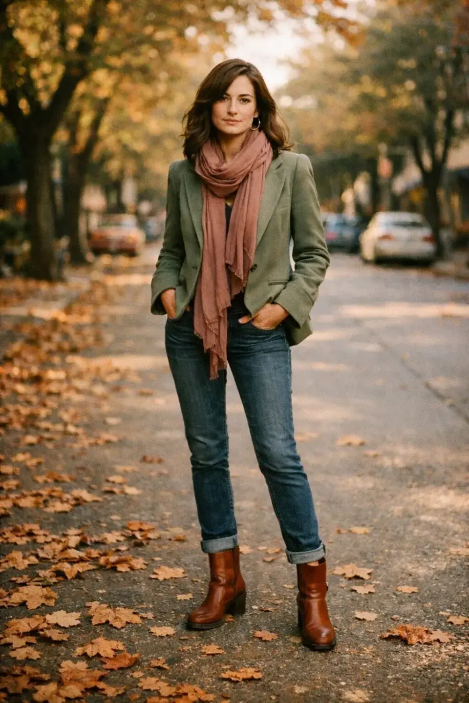
Everyday Looks
For casual wear, soft autumn colors create an effortlessly put-together appearance that I find endlessly satisfying to style. A warm gray-beige top paired with a textured flared skirt, a deep burgundy long-sleeved shirt with neutral bottoms, or a dusty rose sweater with chocolate brown trousers each of these combinations feels cohesive and intentional without requiring much effort at all. That ease is what I love most about dressing within your palette.
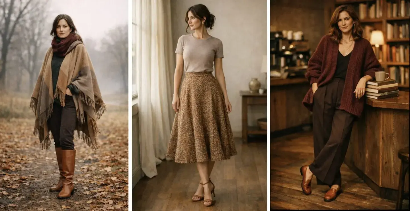
Workwear and Formal Occasions
The palette translates beautifully into professional settings, and this is something I feel particularly confident about. A dark olive turtleneck with burgundy tailored trousers strikes a polished, refined note. A rich cabernet cardigan layered over chocolate bottoms reads as elevated and deliberate. For days when you want something quieter, a light taupe sweater anchors an outfit with calm authority.
Seasonal Styling
Soft autumn adapts well across all four seasons, which is part of why I find it such a satisfying palette to work with. In cooler months, muted-toned ponchos layered over deep green or burgundy pieces create warmth and depth. In warmer weather, lighter earthy knits with leather accessories in tan or caramel feel effortlessly seasonal. Texture is your best friend here suede, linen, and woven fabrics all complement these tones in the most gorgeous ways.
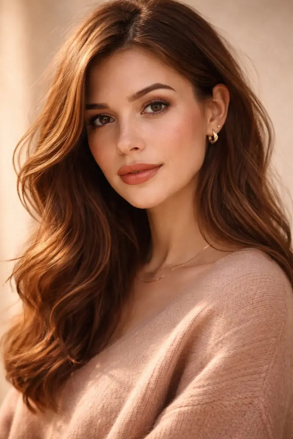
Soft Autumn Makeup

Okay, I have to say the makeup section of this guide is something I’m especially proud of. It took me a while to translate the palette into concrete, usable advice, and I think what I’ve put together here is genuinely useful.
| Category | Best Shades | Why They Work | Application Tips |
| Lip Colors | Burgundy, terracotta, dusty rose, brick red | Warm, muted tones complement your natural lip color | Try matching your lip shade to elements in your outfit for a cohesive look |
| Blush | Peach, coral, dusty rose, terracotta | Enriches golden undertones naturally | Blend upward toward the temples for a warm, lifted effect |
| Bronzer | Warm brown, amber, golden bronze | Adds warmth without appearing orange | Apply where the sun naturally catches the face |
| Eyeshadow | Olive, moss, warm brown, plum, amber | Earthy tones enrich the eyes without overpowering | Layer warm browns with olive or plum for depth |
The principle throughout is the same: warm, muted, and harmonious rather than sharp or high-contrast. When your makeup aligns with your palette, everything skin, eyes, lips just comes together.
Hair Color for Soft Autumn
Hair color is one of the most impactful ways to either enhance or work against your natural coloring, and this is a topic I feel really strongly about probably because I’ve made some hair color mistakes of my own over the years!
Shades that tend to work beautifully include soft chocolate and chestnut browns, warm caramel highlights, muted copper, and auburn with golden dimension. These tones complement the warmth of the palette without being too vivid or intense; they look natural, dimensional, and completely in harmony with your complexion.
Colors to approach with caution include ash blonde, platinum, jet black, and any highlights with cool or silvery tones. These create a contrast with soft autumn’s warmth that can feel slightly off like a beautiful painting in the wrong frame.
Building Your Soft Autumn Wardrobe
I genuinely think this section could save you hundreds of dollars and hours of frustration, and I mean that sincerely. Building a capsule wardrobe around this palette is one of the most practical style decisions you can make.
Start with a foundation of key neutrals, camel, olive, warm taupe, and chocolate brown in versatile staple pieces. Layer in accent colors like sage green, dusty rose, and terracotta as you build out the collection. Everything will coordinate, almost by default, because the palette is so inherently harmonious.
For accessories, gold-toned jewelry coordinates more naturally than silver, reflecting the warm undertone of the palette. Leather goods in tan, camel, or warm brown anchor the earthy, natural character of soft autumn styling in the most beautiful way.
And if you love interior design the same palette extends gorgeously into your home. Warm beige walls, terracotta accents, olive and mustard textiles a soft autumn home feels like a warm embrace.
Final Thoughts
I put a real amount of care into this guide, and reading it back, I feel good about what’s here. This is the resource I wish I’d had when I first started exploring seasonal color analysis thorough, practical, and written by someone who has genuinely lived this transformation.
Understanding the soft autumn color palette isn’t about following rules. It’s about giving yourself a reliable framework for choices that feel good and look good every single day. When you know your colors, shopping becomes more purposeful, getting dressed takes less energy, and the results are consistently more beautiful than anything you’d arrive at by guessing.
Start small. Find your best neutrals. Add one or two accent pieces in flattering shades. Pay attention to how you feel. The shift might surprise you.
If you’ve discovered you’re a soft autumn or you’re still exploring I’d truly love to hear from you in the comments. What’s your favorite shade from the palette? Let’s talk about it.

